Bike Store adds frontal appeal
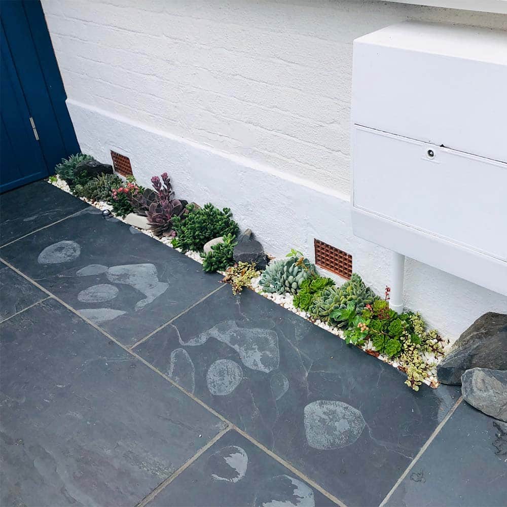
Creating kerb appeal can be a challenge with limited space to play with. The smaller the space the more refined the design needs to be with every item scrutinised and needing to perfectly reflect your home and personality.
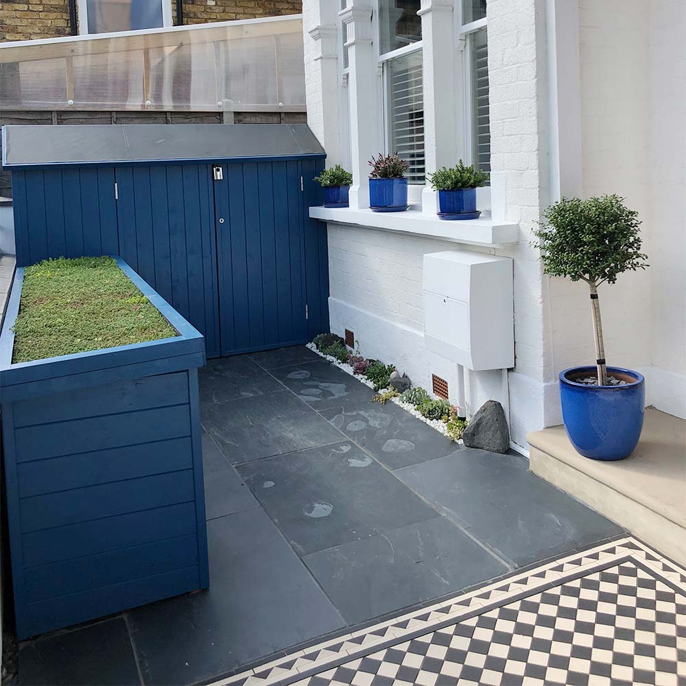
Sara Firth has achieved this perfect balance at her home. The front entrance to her home is now a practical and elegant space that will turn many heads and offer design inspiration for others in their transformations. Using the right wood paint colour can totally transform your outside space and Thorndown use long-lasting VOC free exterior-grade pigments for great colour.
Originally they were going to use a wood stain but decided they’d prefer something with a bit more “POP”. Having lived there for 8 years and refurbished their home, they discovered they have an obsession with BLUE! Even their lounge room is dark blue so they naturally gravitated to blue paint for the exterior. At first their contractor was dubious about such a strong colour but agrees it looks incredible.
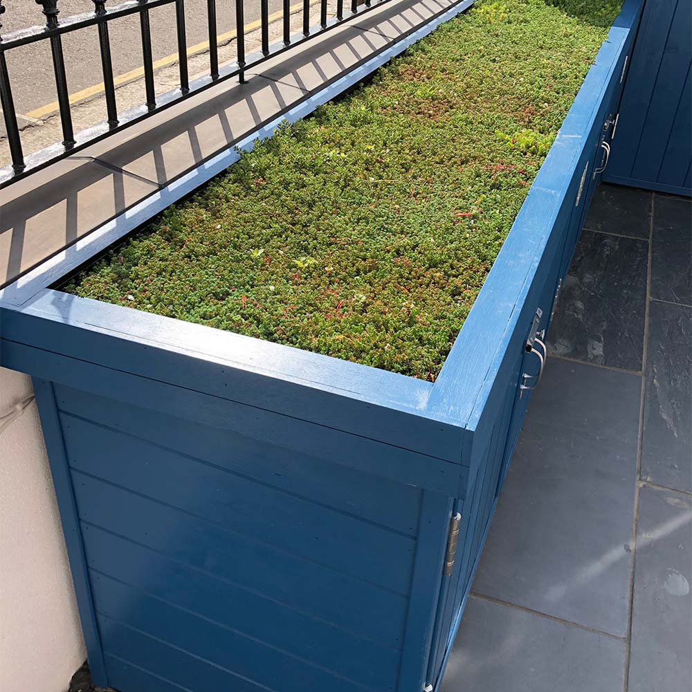
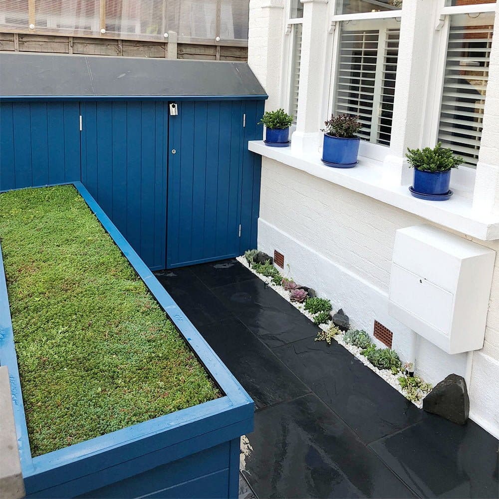
They wanted to design an area for the bikes and scooters so they were easy accessible. The bike store was custom built to fit snugly in the space giving plenty of room. Complimenting and adding extra storage space with another store completes the design, balancing the space perfectly.
Painted in Bilberry Blue the stores look elegant and refined, and will be protected for up to 10 years. Thorndown Wood Paint is a high-performing exterior and interior paint, that produces a water-repellent protective coating.
The exterior-grade colour pigments are strong, vibrant and will stay ‘true blue’ for many years. Bilberry Blue is very much a modern take on Royal Blue but with a more natural feel to it.


